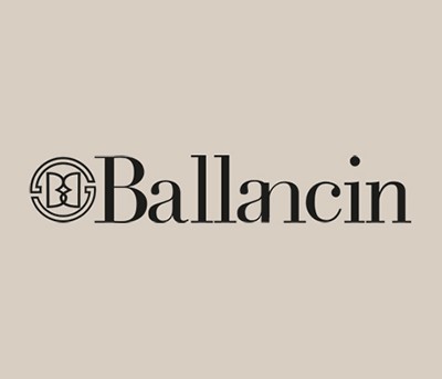
Transformed to mark their continuity.
In the logotype, the decision to retain the initial capital letter is the fil rouge that links past and present together. The concatenation between the “a” and “n” – with two letters one on top of the other – harks back to the intertwining of the two capital “B”s in the pictogram.